02 / Brand study
Unpin.
Brand strategy · Visual identity · Product marketing
Useful by design.
A clear, recognizable identity for everyday digital tools. Built around the small frustrations everyone knows—and the relief of getting past them.
Explore the brand
unpin.toolsThe idea
Make the benefit immediate.
File tools can feel fragmented and technical. The creative direction makes the value easy to grasp: one name, a recognizable mark, and plain language that tells people what they can do.
Identity.
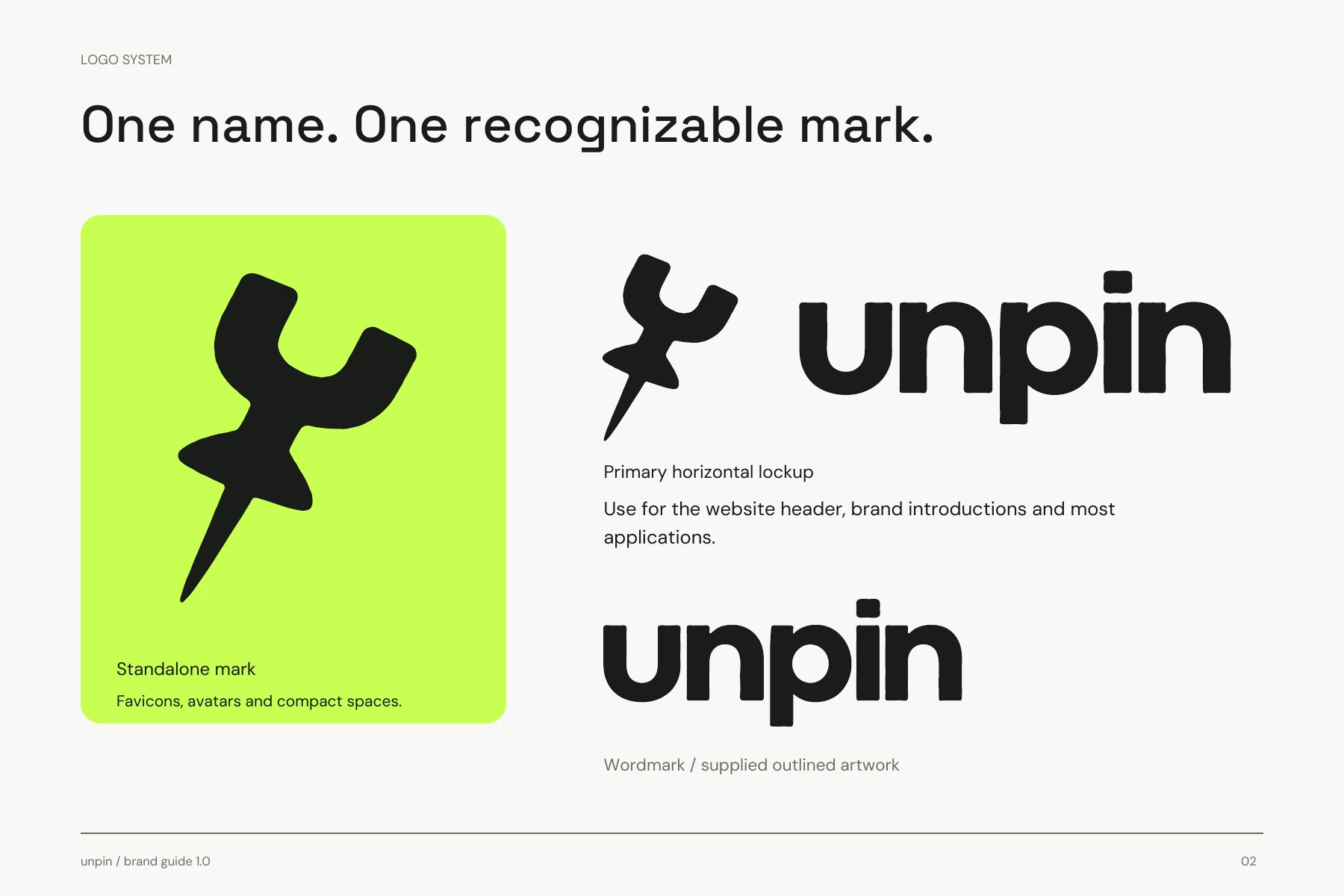
The U-shaped thumbtack makes the name tangible. Ink and ivory keep the system clear; lime gives it a distinctive signature across icons, social assets, and the product.
Voice.
Lead with the task. Compress a file. Switch a format. Remove a background. Short, direct language makes a broad toolkit feel approachable.
Marketing.
Show the change. A large file becomes a small one. A video becomes audio. Before-and-after examples turn features into a story people recognize in seconds.
Product storytelling
File too big? Wrong format?
Unpin it.
The expression
One identity. Every touchpoint.
A consistent visual language connects the product, app icons, social creative, and launch messaging. The same simple promise carries through each format.
The throughline
The Internet’s Toolkit.
A practical product with a memorable name, a clear visual signature, and messaging grounded in everyday use.